ZEe Design
Project Details
ZEEDESIGN
2016
Tools
Adobe Illustrator
Creative Field
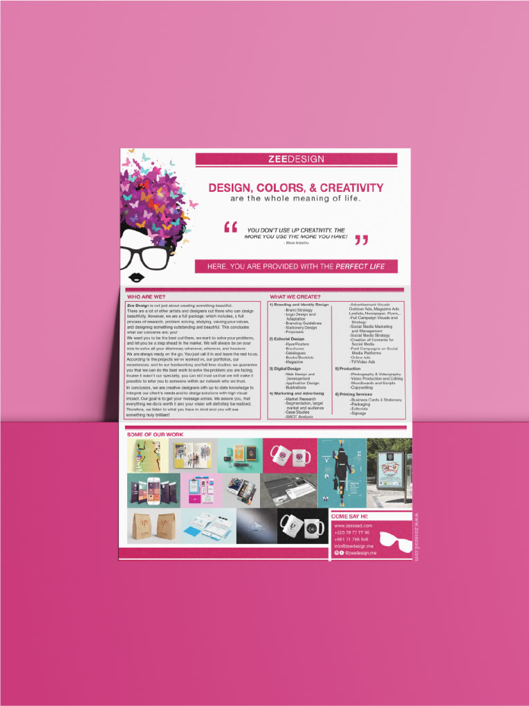
Rebranding, Logo, Identity, Stationery, Posters, Guide of Decoration, Market Research, Market Plan, Psychological Research, Advertisement, Tri-fold Flyer
ZEEDESIGN is a Graphic Design and Advertising Agency.
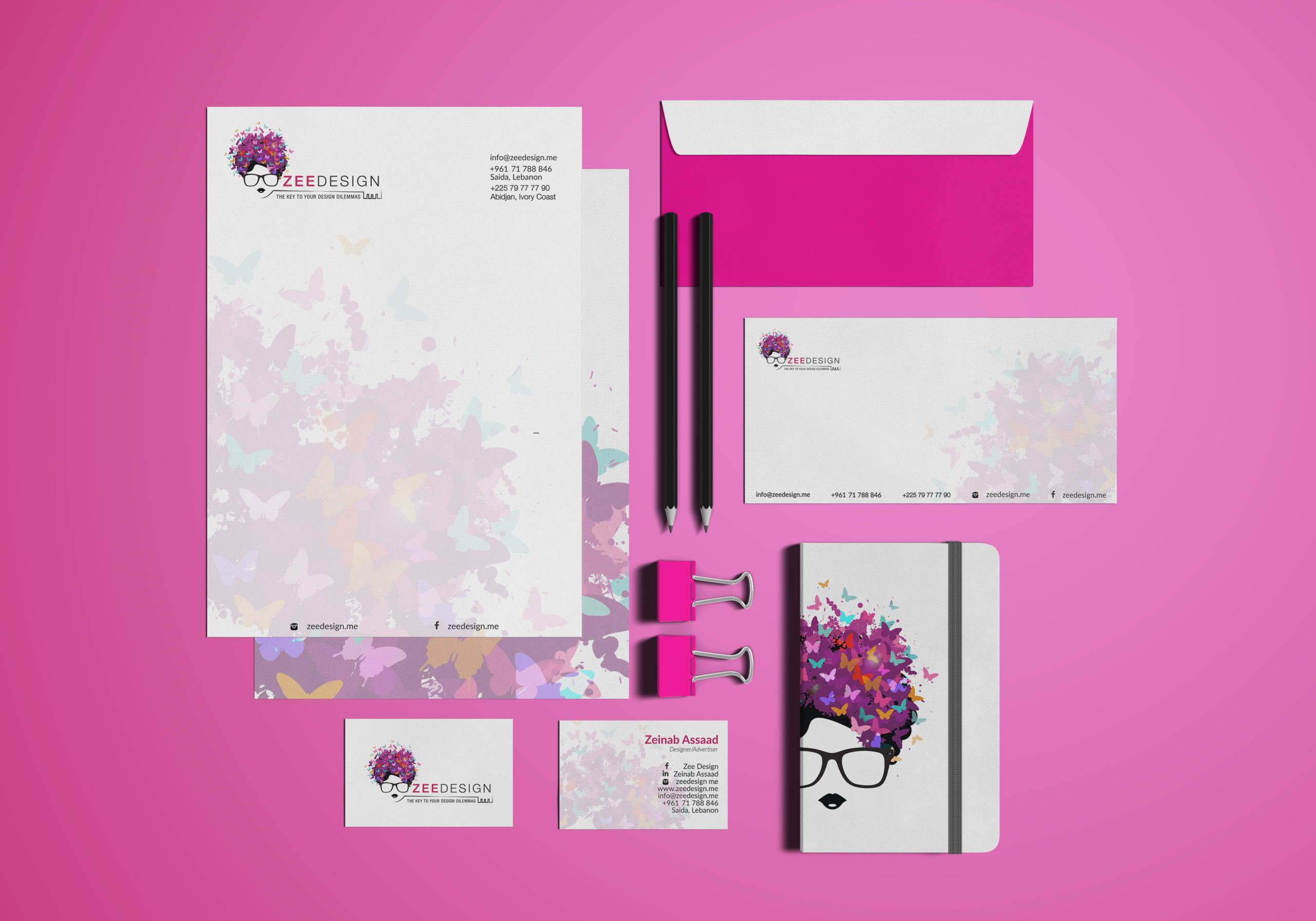
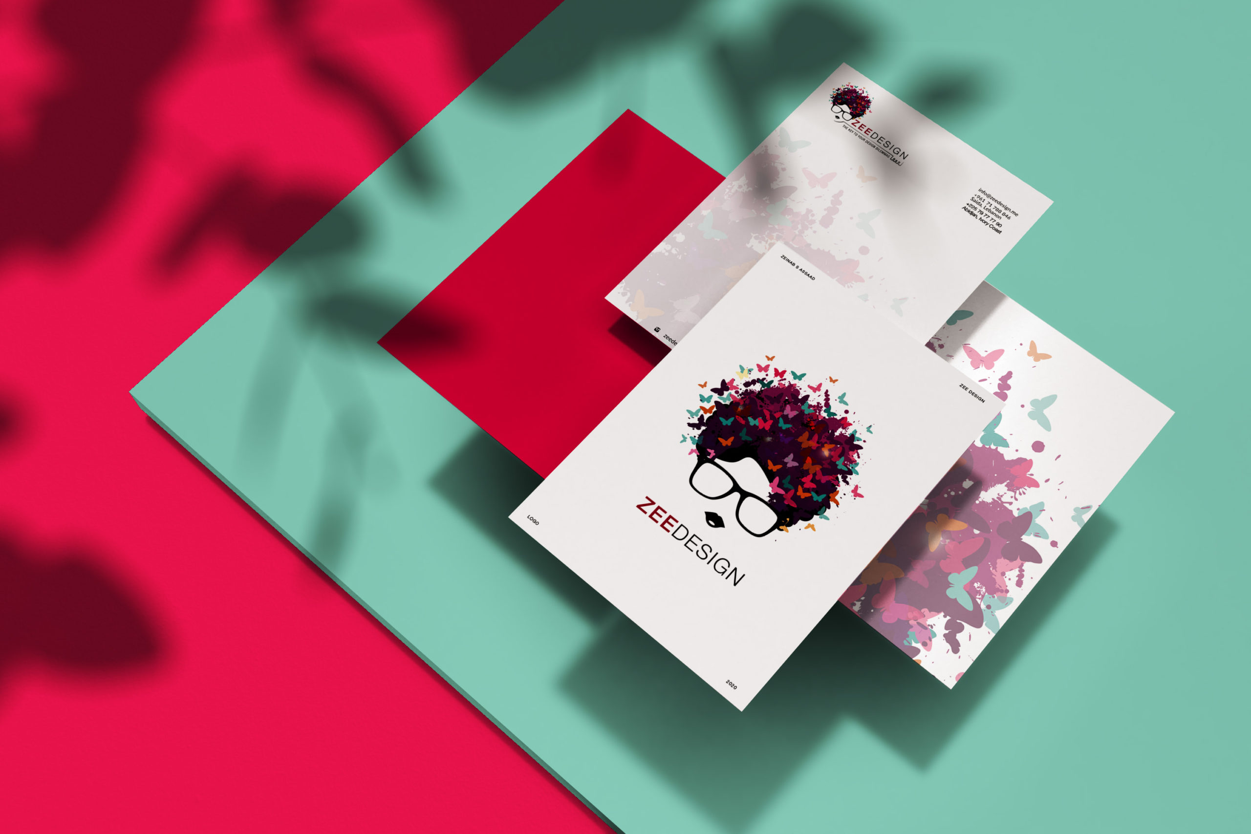
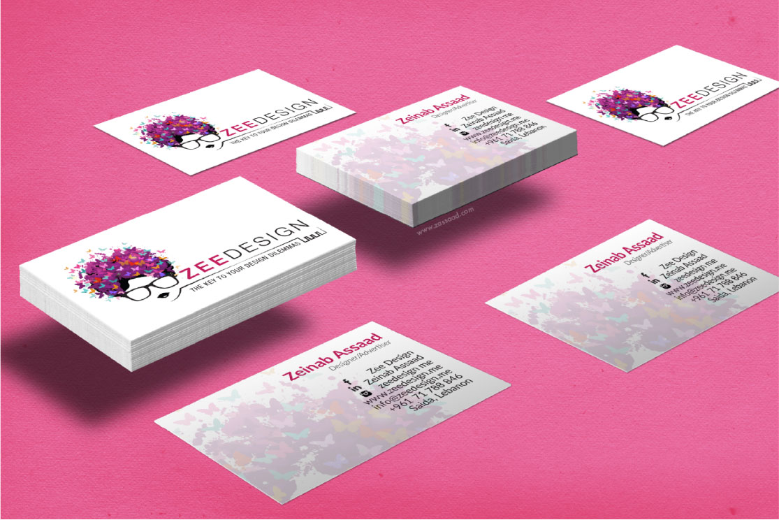
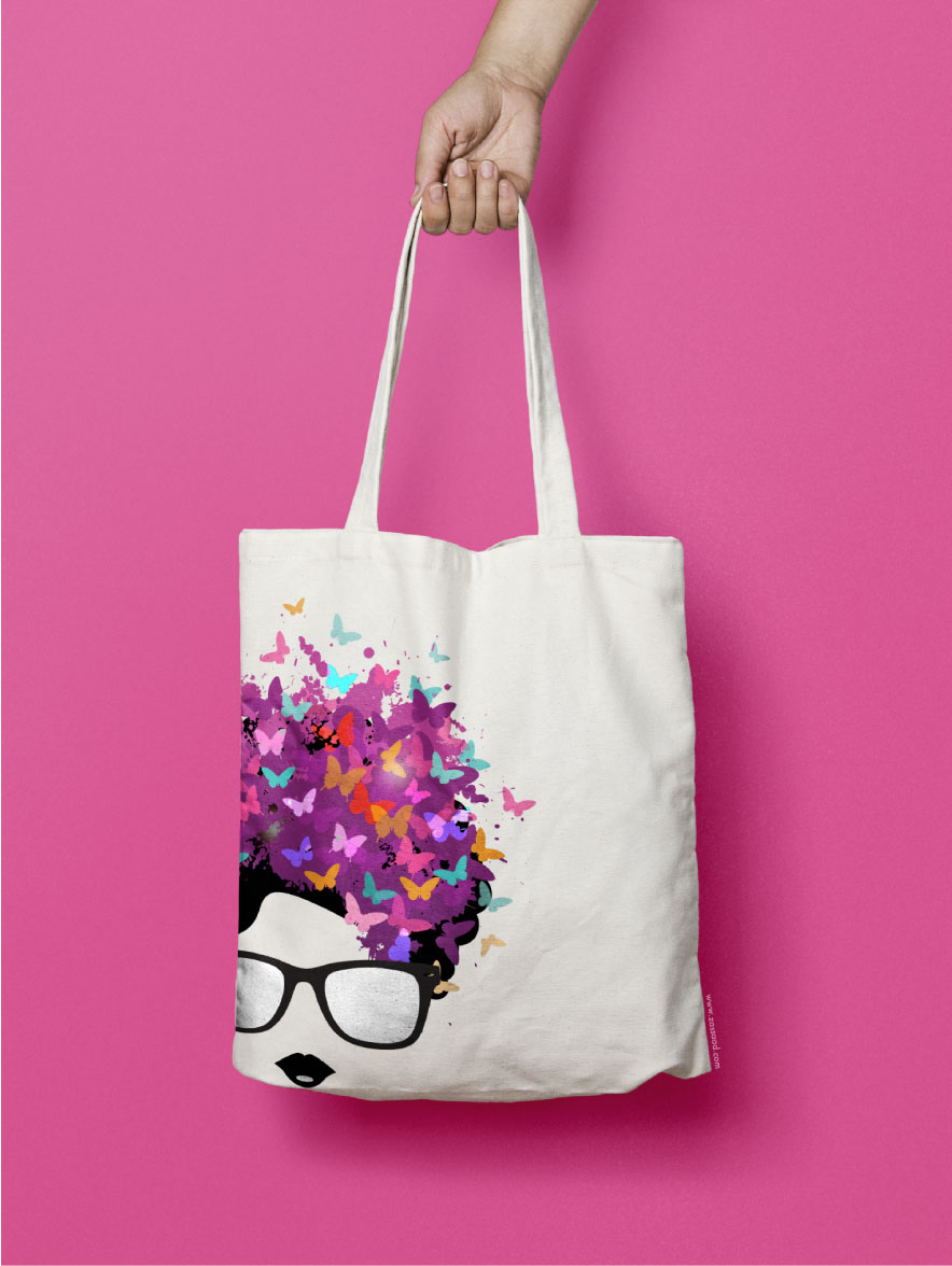
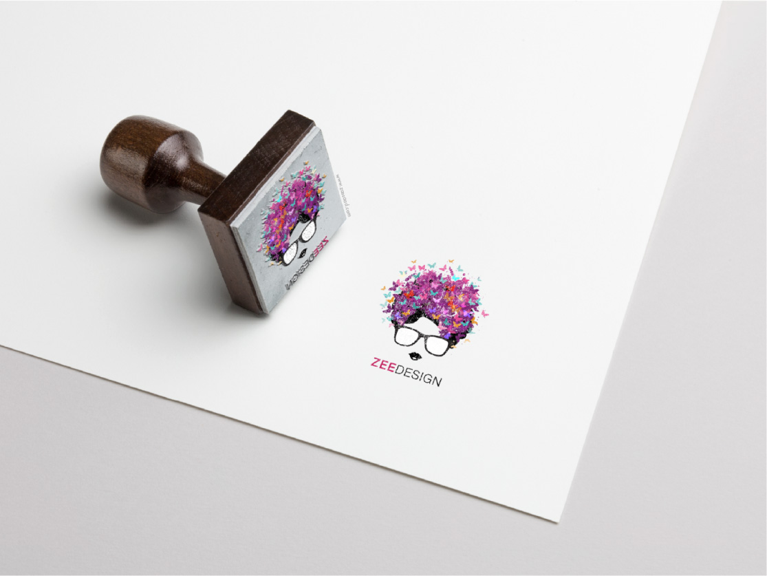
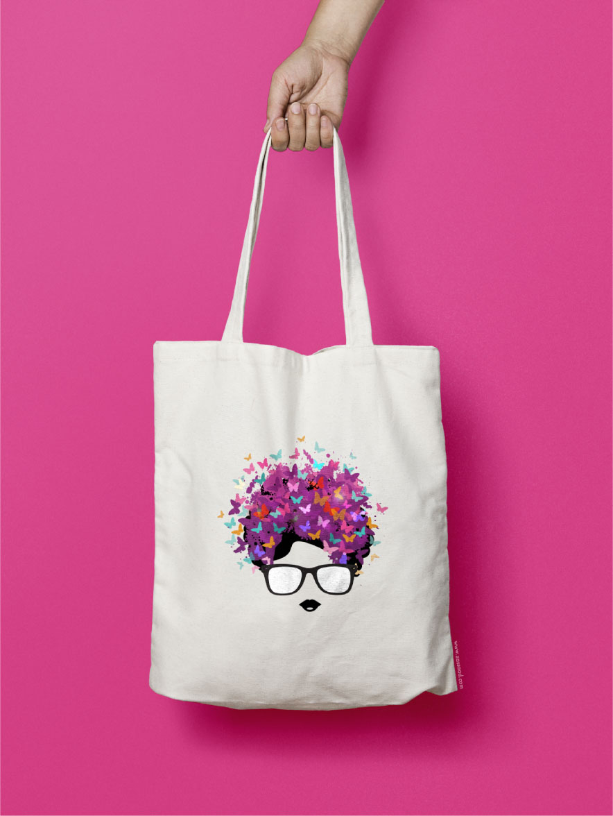
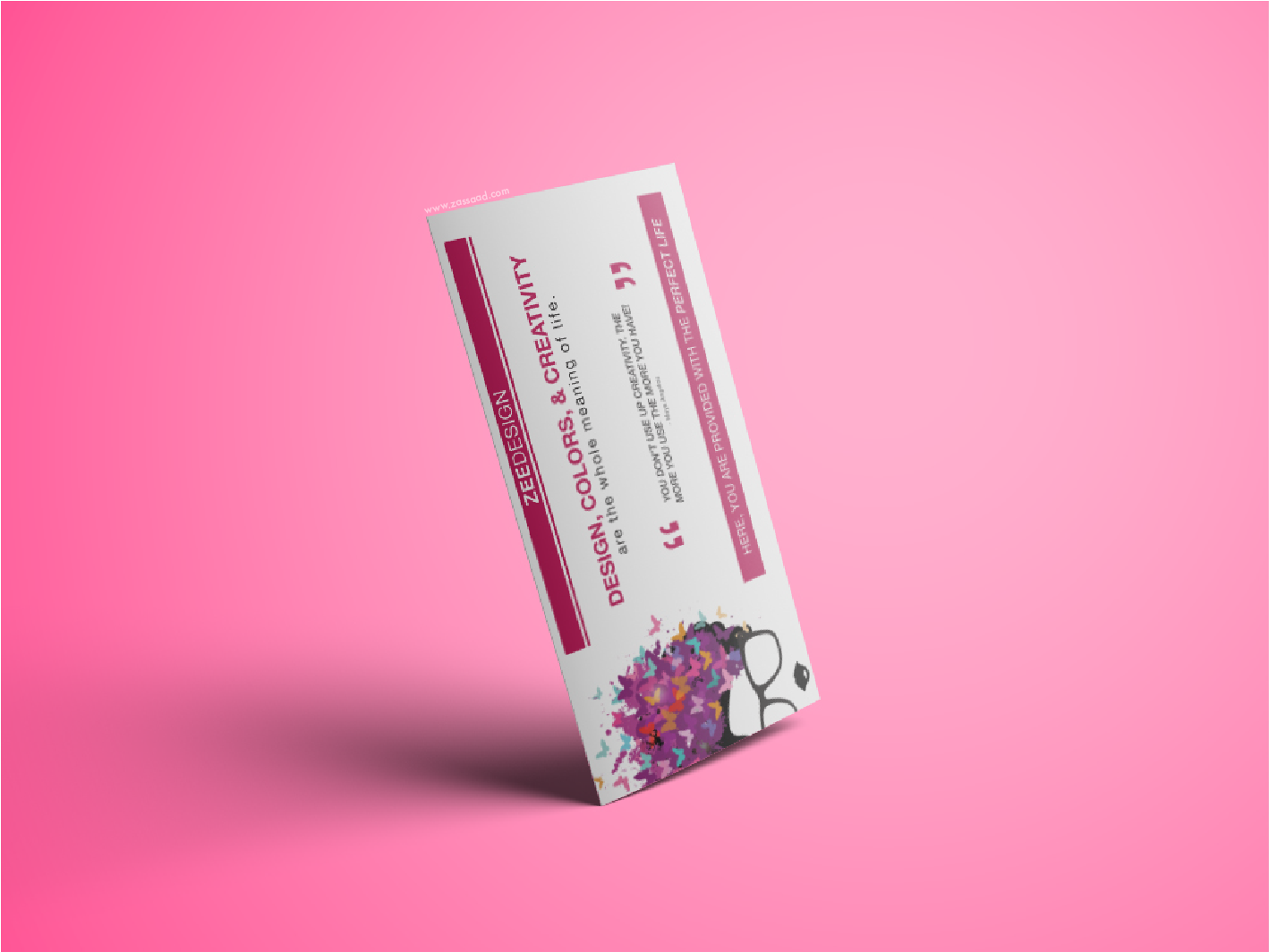
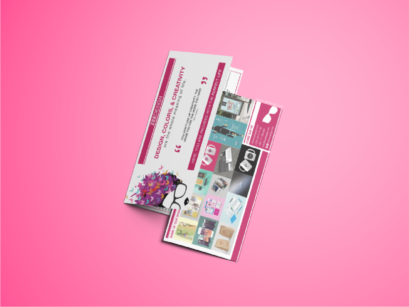
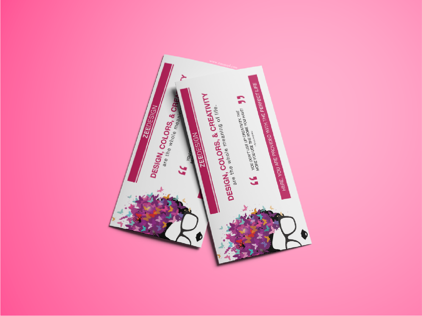
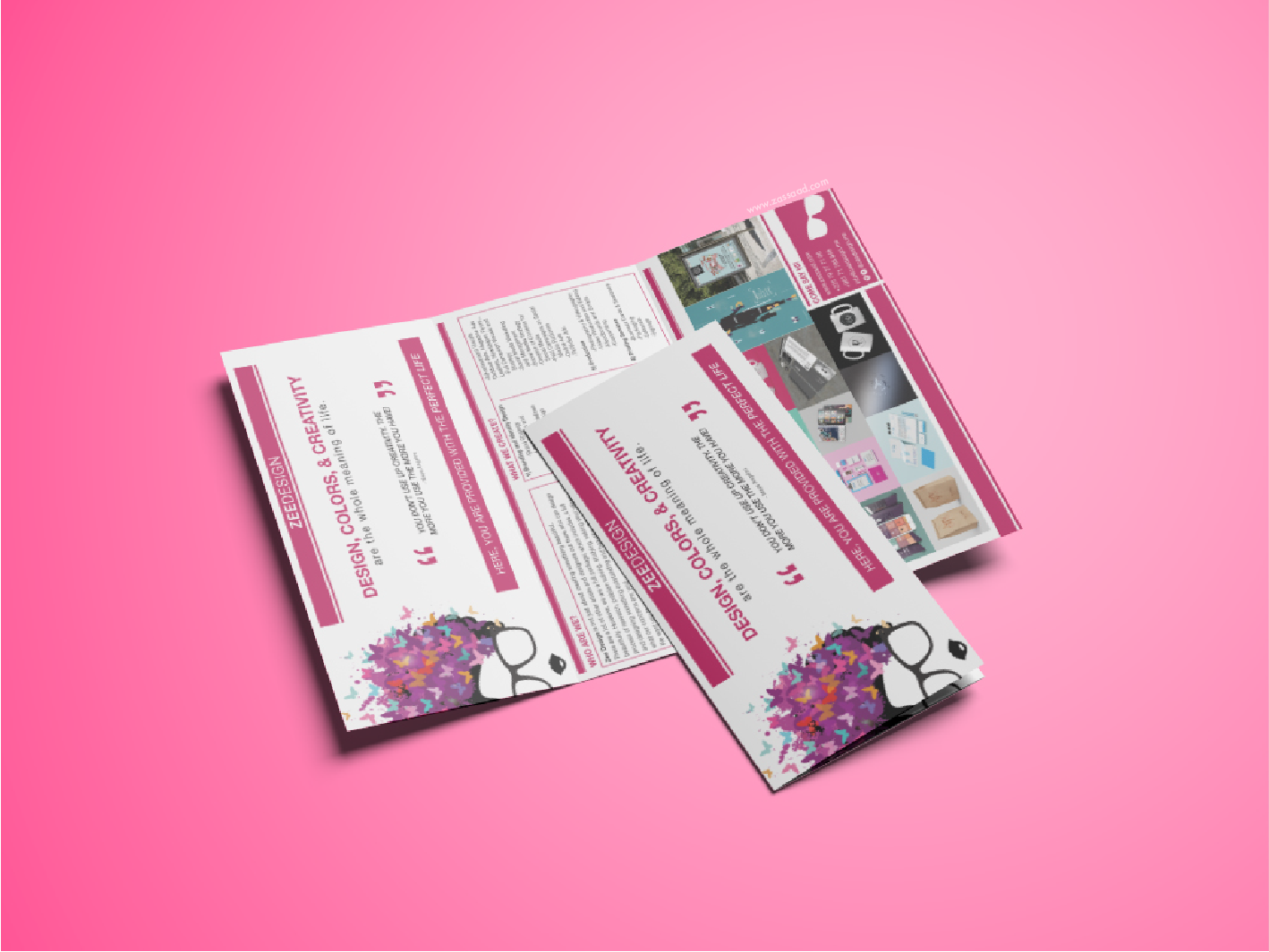
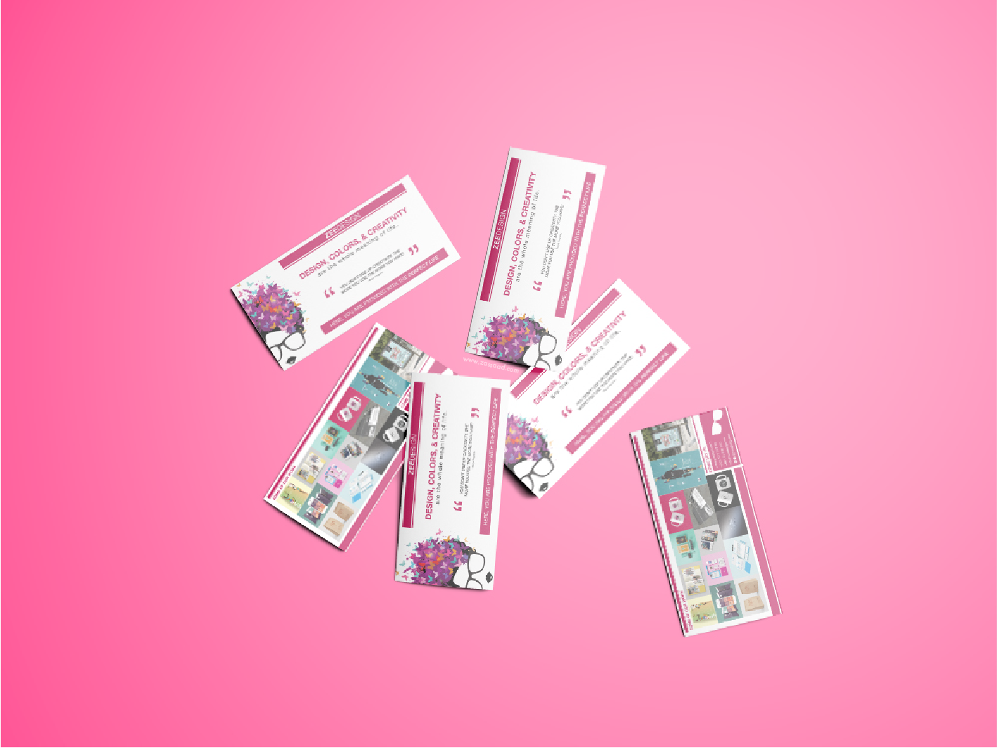
An overview of project: A Logo redesign was created with a totally new identity concept and color swatches. Later a full branding was designed including brand elements with a guide for design, and a market plan and study. Also designed and printed a tri-fold flyer.
Mission Statement
“We have the key to all design problems we see and face everyday. We are your solution to make life a more creative, inspiring, comfortable, and a colorful place. ZEEDESIGN is the key to all your design problems.” – Zee Design
Brand Platform: Brand Promise
ZEEDESIGN believes that they can provide the client with a creative solution that will definitely make them happy and satisfied.
Our services play a huge role on always finding solutions for you.
We are always available to create something unique and creative. We seek perfection. You have a problem? We are your solution!
We are available and collaborative on Social Media Platforms.
We are also compelling. We are interactive and entertaining. We seek to participate with as much events as possible just to show the world our creativity, as well, how fun, entertaining, and crazy we are!
We could say that we are personalized, because we provide each client with what they need. We never repeat. You ask and we get on it.
We respond quickly. Through Whatsapp, Facebook, Instagram, or even by phone call and emails.
And we are ready to get working on your complication.
Brand Platform: Brand Personality
ZEEDESIGN is ambitious, brave, energetic, and entertaining.
The brand personality describes the tone, the feeling, and the manner of ZEEDESIGN that wants to reach out.
Either in the things we say or show, with customers and other audiences.
Ambitious: We always seek high levels and have a goal that we need to keep going.
“The Key to Your Design Problems”
Brave: We are fearless. We could get crazy but reasonable. We don’t have to always follow rules we can be unique.
Energetic: We are always active, hyper, and ready for any problem solving. We just enjoy and love what we do!!
Entertaining: We are not boring. We are not routine. We don’t like to show “eeh” messages! We like to show “WOW”, unexpected, concrete, yet simple messages. “Clichés” is not in our dictionaries.
In addition, we are friendly, welcoming, funny, and crazy as personalities. We are like that so we could prove and show and be able to deliver what ZEEDESIGN believes in!
Old Logo
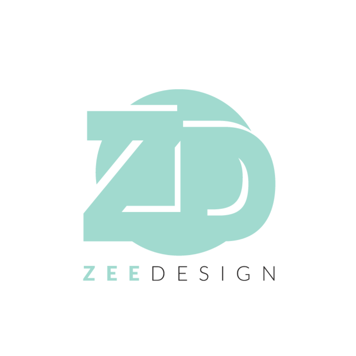
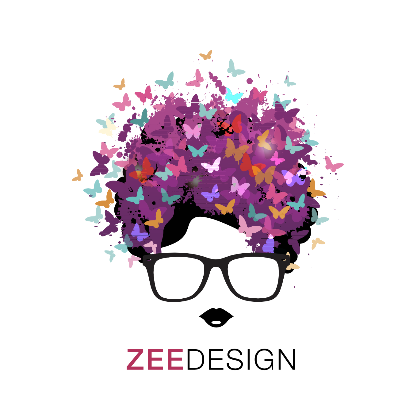
Logo Rebranded to THIS!
Visual Identity
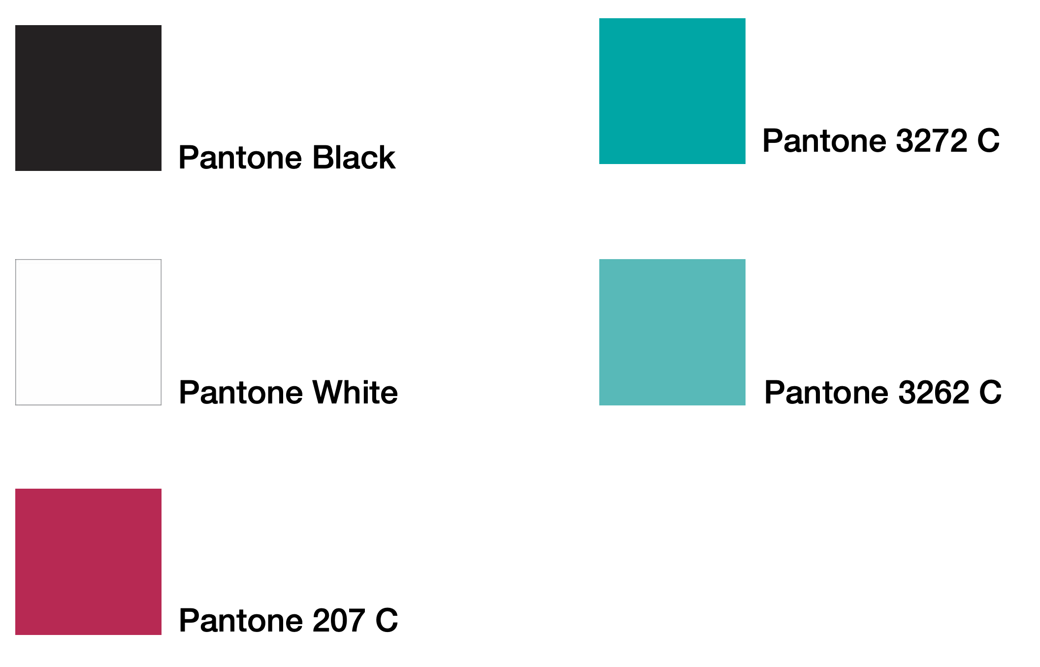
The “ZEE” could either be; black, white, or the main color; Magenta. The “DESIGN” could either be; black or white.
The colors that represent the identity of our brand are;
– Black
– Magenta
– 2 Teal shades
Typography | Typefaces
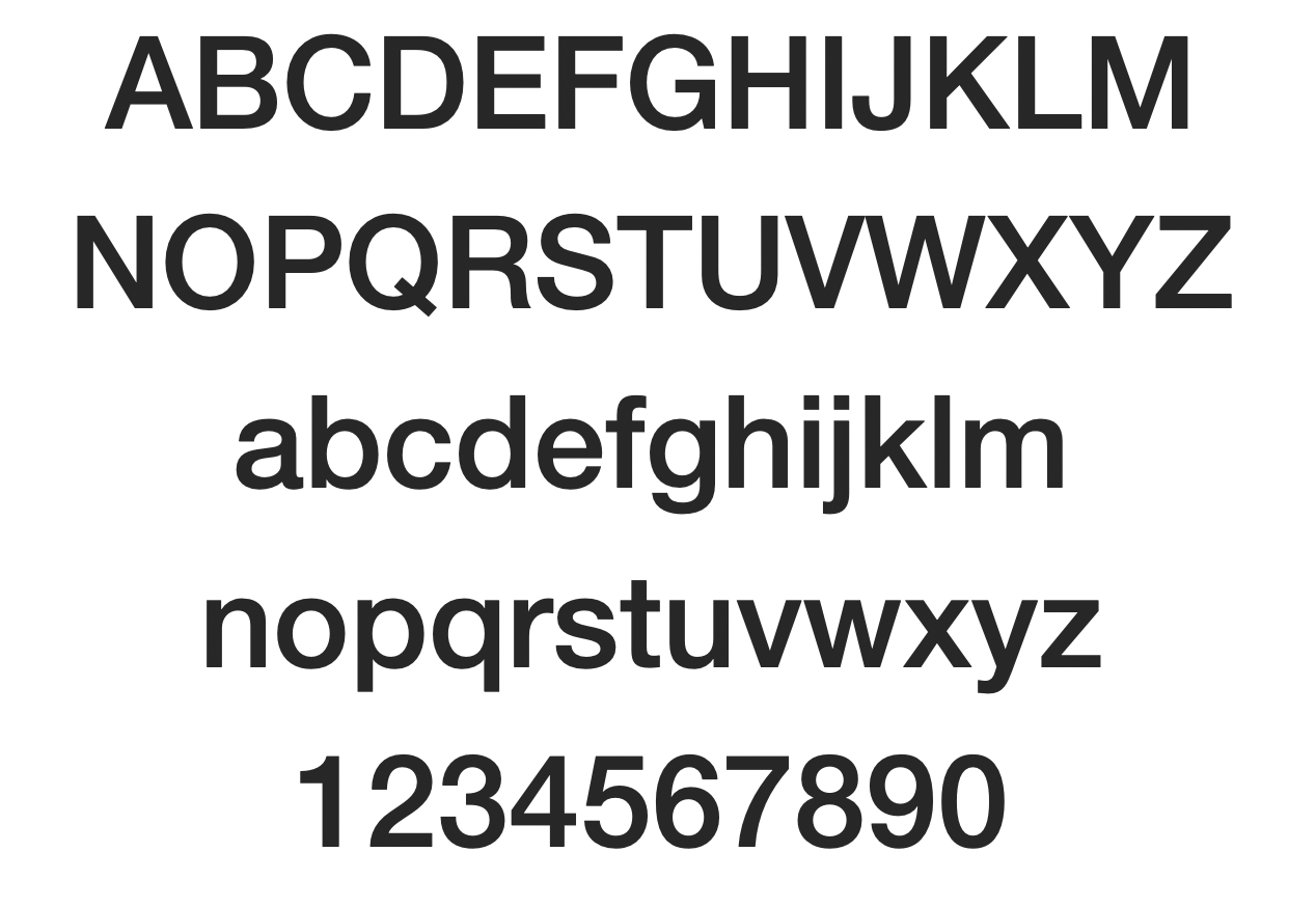
Fonts used for the Identity:
Helvetica Neue LT Std. [The whole Family]
Fonts used for the Logo:
Helvetica Neue LT Std.
ZEE – 65 Medium
DESIGN – 45 Light
Tagline “THE KEY TO YOUR DESIGN PROBLEMS” – 57 Condensed
Deep dive into the Meaning of Colors used for Identity
1. Magenta: The messages this color sends to our customer base can have a major impact on our business success.
Magenta is a color of universal harmony and emotional balance. It is spiritual yet practical, encouraging common sense and a balanced outlook on life.
It represents universal love at its highest level. It promotes compassion, support and kindness and encourages a sense of self-respect and contentment in those who use it. It can assist ambitions and desires to become reality. Physiologically this color helps us to flow with life and let go of old ideas.
Magenta is a strong and inspiring color that can appear innovative and imaginative. It is particularly attractive to the non-conformists in the community.
Positive Color Meanings in Business:
- Universal harmony and love
- Emotional balance
- Helps our spirit soar
- Spiritual yet practical
- Encourages common sense
- Loving, compassionate, supportive and kind
- Imaginative, innovative, creative and artistic
- Non-conformist
In business applications, magenta is most suitable to those in artistic or creative fields, such as artists and designers.
Effects of Magenta:
Emotional Balance: spiritual yet practical, it helps to create emotional, physical and spiritual balance.
Compassion: gentle and caring in its approach, it generates acceptance, tolerance, support and patience.
Inspiration: inspires cheerfulness and optimism, creativity and innovation, dream activity, positive change and negotiating skills.
2. Black: Psychologically black means authority, power and control. It can also be seen as sophisticated, dignified and serious. Black is favored by the youth market aged approximately 16 to 25, who are still trying to find their own sense of identity and place in this world. Those who are achievement oriented and ambitious also favor black.
Black board with printing in any of the jewel colors of red, emerald green, magenta, or bright blue, or gold, silver or white will create a dramatic impression. Black packaging can make an item appear expensive and heavier, it creates a classy and elegant impression.
Positive Color Meanings in Business:
- Authority, power, control
- Protection and comfort
- Strong, contained, formal
- Sophisticated
- Seductive, mysterious
- Endings & beginnings
Using black for selling and marketing products and services to the high-end youth market, is seen as cutting edge and trendy. The youth market tends to be attracted to black with its sophistication and rebelliousness.
3. White: In color psychology white is the color of new beginnings, wiping the slate clean, so to speak. It is the blank canvas waiting to be written upon. While white isn’t stimulating to the senses, it opens the way for the creation of anything the mind can conceive. Physiologically, white is calming as it creates simplicity, organization and efficiency out of chaos. It clears the way forward.
White’s basic feature is equality, implying fairness and impartiality, neutrality and independence. It is a reassuring color that helps to create order and proficiency. It also amplifies everything in its way.
Positive Color Meanings in Business:
- Innocence
- Purity, cleanliness
- Equality, complete and whole
- Simplicity
- Immaculate and neat
- Self-sufficient, pristine and open
- New beginnings
White is probably the best color to use as the background color for websites. It allows all other colors to reflect from it and makes all colors except yellow and pastels to be very readable. Using white for negative space on your website makes it look clean, open and uncluttered.
4. Teal: helps to open the lines of communication between the heart and the spoken word. It presents as a friendly and happy color enjoying life. In color psychology, the color turquoise controls and heals the emotions creating emotional balance and stability. In the process, it can appear to be on an emotional roller coaster, up and down, until it balances itself. Turquoise heightens levels of creativity and sensitivity.
This color can trigger creativity and energy. It gives a sense of restorative calm. And it can encourage introversion and reserved character traits. This color can go either way when it comes to attracting men or women.
Positive Color Meanings in Business:
- Clarity
- Idealism
- Balance
- Creativity
- Compassion
- Self-Sufficiency
- Optimism
- Healing
- Uniqueness
- Intelligence

